Using Colors to Create Cohesive Interior Design
If you’ve ever seen pictures of my city house, one thing you will notice is that there is a lot of color. I think there’s something like 23 total colors all over the house. The colors show up everywhere, not just in the wall paint, but also in the furniture, the drapery, accessories, and art. If you are thinking of ways to use color in your interior design, every possible feature of your house can be a vehicle of your preferred color.
A lot of you are asking me for interior design tips, so I wanted to talk a little bit about using color in your house. I feel like creative use of colors can give your home a timeless look, spotlight a certain feature of your house you want to show off, make seamless transitions from room-to-room, and of course add a mood that carries throughout your whole house.
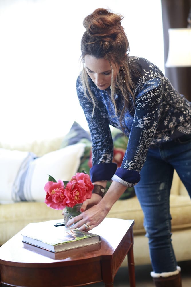
I’ve always wanted my house to look timeless, and using colors strategically is an easy way to get that timeless look without spending a lot of money. In my experience, it is the least expensive way to add that extra “punch” of personality to your home. A home with a well-thought out color scheme comes across as a home that has been cared for, worked on, and refined throughout the years.
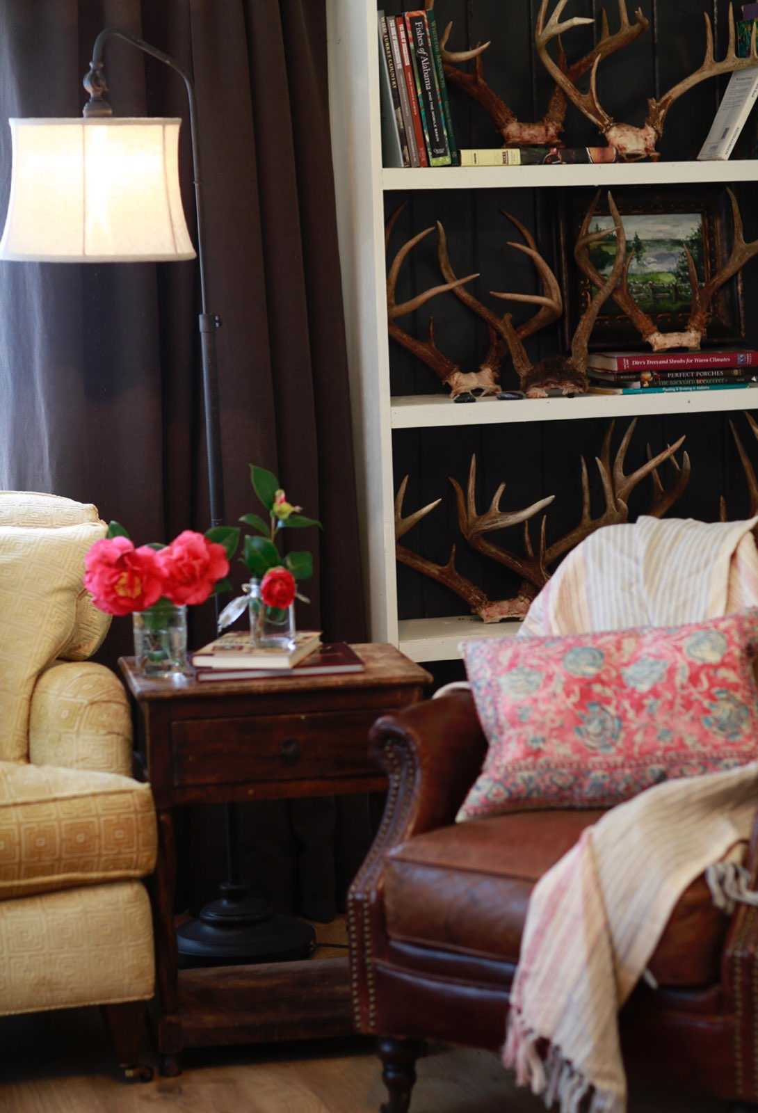
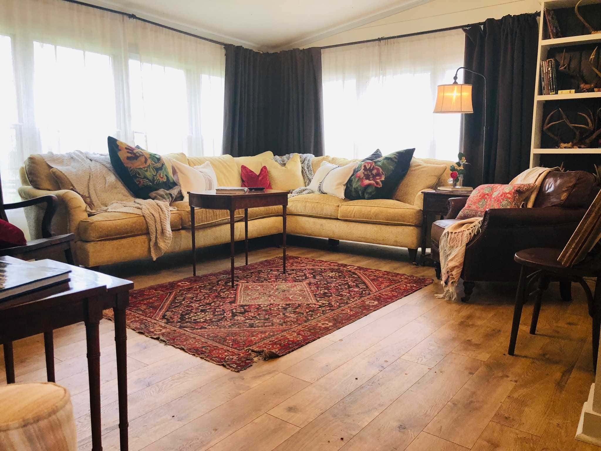
My first tip for introducing color into your home is deciding on your preferred color palette. For the purple door, I used cream, gray, and yellow. Basically it’s cream on the walls, gray on the molding, and yellow showing up in some of the accent pieces, like the furniture, art, and accessories. Those are the main colors, but you’ll see a few other colors come in that are a part of that color family. By sticking with those colors from my palette throughout the whole house, I’ve created a unified theme to my decor that’s apparent no matter which room you’re in. You don’t have to stick with three, but since my Purple Door house is so small, a simple color palette gets the job done. By the way, these colors are really interchangeable, so if I wanted to switch it up in a different room of the house and go with yellow walls and gray curtains, then it would still make sense in the design because I’m sticking with the color palette.
Another tip I want to give you is to use black in every room. In the Purple Door house, I’ve got black curtain rods and black in my picture frames and wall mounts. Black is a color that adds serious depth to your design pieces. Using black creates definition and detail that is really important for interior design.
As you can see, accent pieces and furniture are a great way to bring color into the room. Some of my most prized accent pieces are actually rugs. We often overlook the floors when attempting to show off our style in interior design. Adding a rug is a great treatment to a bare floor, and it’s an easy way to bring in some much needed color. In the Purple Door house, I like to use warm colors like yellow, orange, and reddish-orange in my rugs.
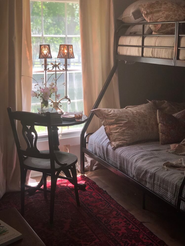
For those of you that are afraid of “too much color” (I know you’re out there!), you can always ease the color in by focusing on a single room, like a powder room, bathroom, or a child’s bedroom. Children will have no problem with a super colorful bedroom, and it gives you a chance to experiment to find your right color palette.
Now for my own bedroom, I tend to use more subdued colors. Why is that? Because the bedroom is a place of rest, and I think getting too busy with colors in the bedroom gets in the way of that. Some people want their bedrooms to have as much personality, and therefore color, as possible, and that’s totally okay. But I usually focus on neutral grays and earth tones in my bedroom, focusing on tranquility and peacefulness.
Regardless of how you use colors throughout the house, it’s important to focus on your transition points between rooms. Consider the colors your using in one room, and build off those same colors as you transition into the rooms next to it. Doing this will make the design cohesive. Any design can look beautiful, even if I personally dislike the colors, if I can tell that it’s been carefully thought out.
So those are my thoughts on designing with color. I hope it wasn’t too much! Like I said, I use a lot of colors in my house, but most people can’t tell unless they are trying to count them all. When it’s all said and done, you probably won’t notice the individual colors as much as the total effect of the design. And if I accomplish that, I know I’ve done good work as a designer!
For all the people who comment on my stuff and ask for help with design, try out some of these tips! Send me some pictures if you’d like, I would love to look at them! Try to find your color palette, use black to add depth, and focus on making your accent pieces and transition points sing!
